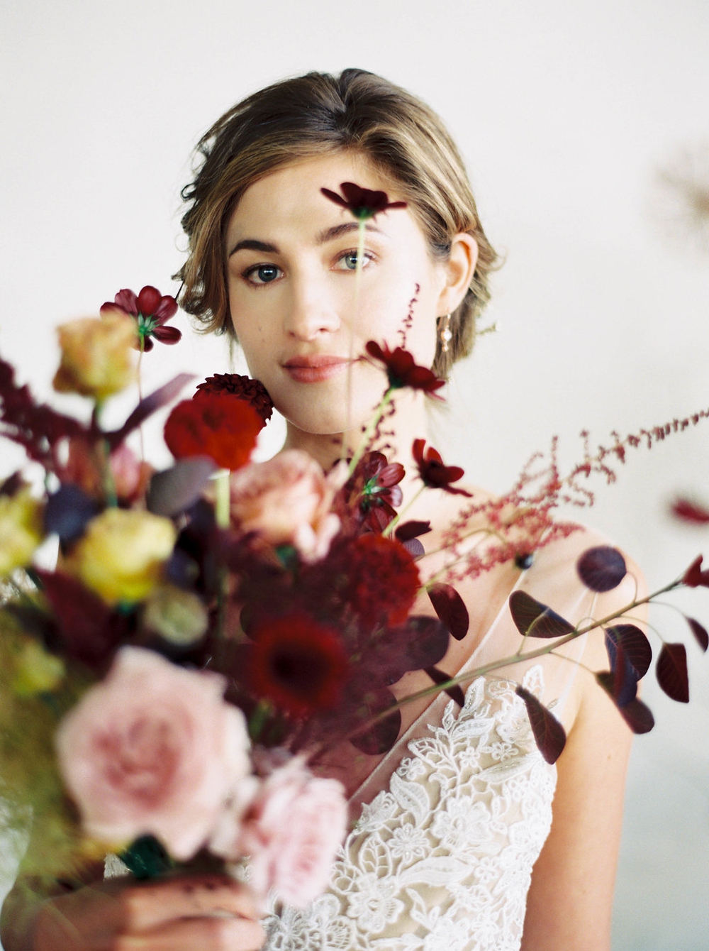
Chopin Editorial Shoot
Floral design is an art. Its value has been diminished and diluted over the past half century of factory farmed flowers sold in pre-designed arrangements by the likes of 1-800-FLOWERS and similar wire services. But flowers really are an art, one that is ephemeral and fleeting and has the power to evoke emotions like any other art form. In that way, floral design is a bit like music. Flowers can be photographed to be enjoyed later, and music can be recorded to be enjoyed later, but both are best enjoyed in the present.
Okay, of my musings about art! What got me onto this topic was this editorial! The whole thing was inspired by music, one song in particular! Chopin’s Prelude in E Minor. Using music as inspiration for a wedding editorial isn’t new - there are lots of shoots with styled sheets of music and violins. With this concept, we wanted to be more abstract in interpreting Chopin’s masterpiece for a modern wedding, so we looked to the pieces’ essence: it is simple, raw, and organic. The song is romantic in an understated and realistic way. It documents a mature view of love that seems to say, "I'm making the conscious choice to love you more deeply every day despite your flaws and imperfections."
The movement and tone of the piano piece, driving low chords and light right-hand melody were all carefully considered in every design decision. The dark and moody color palette mimicked the melancholy feeling of the piece. Luxurious burgundy and a warm coffee tan with lighter pops of blush and ivory were used throughout the design to emphasize the rich movement of the music.
This played into the florals in multiple ways. First, instead of using traditional greenery, we used mostly deep burgundy and purple foliage to add depth and mood. Upon that layer of foliage, we added fruiting crabapple, brown lisianthus, burgundy dahlias, chocolate cosmos, and mauve koko loco roses to provide highlight colors and deepen the texture. This was primarily evident in the ceremony arch, which we built as if it were growing up from the ground, starting low and coming to a crescendo, just like Prelude in E Minor. The bouquet was similarly sparse but lively. Its depth of color built as the bouquet progressed and little bits stood out as highlights.
Handmade paper in different neutral colors and styles emphasized the music's driving repetition and complimentary simple melody. We chose stacked rings in various metals and designs instead of a typical engagement and wedding band combination. The cake was a showstopper with faux fabric cascading down the side and edible flowers that could make anyone think they were real.
You can see the full feature on Magnolia Rouge here.
I know I mentioned the cake earlier, but can we just look at it again? Those sugar flowers are works of art! As a floral designer, I am not easily impressed by flowers that aren’t of the earth, but these are truly spectacular!
Also, I am pretty sure that this fellow deserves the most handsome groom award. Every time I share a photo of him on Instagram, the Internet almost breaks with floods of compliments.
VENDORS:
Photography: Sarah Carpenter Photography | Planning: Wedding Wise | Venue: Metropolist Seattle | Dress Designer: Alexandra Grecco | Bridal Salon: The Dress Theory | Hair and Makeup: Yessie Libby | Cocktails: The Perfect Pour | Cake: Lilac Cake Boutique | Specialty Rentals: Vintage Ambiance | Jewelry: J. Albrecht Designs | Paper Goods: Julie Ha Calligraphy | Hairpiece: Maggie Wu Studio | Film Lab: Photovision Prints


